A brand new logo for the digital era

A new logo for 2021.
The team at Abingdon & Oxford Anglers Alliance approached me towards the end of 2020 with a desire to update thier logo as part of the New Website design. The previous logo has appeared in various forms since 1964 and whilst it carries the history of the club through it’s ‘House Crest’ type of design, it isn’t well suited to a digital environment.
The task was clear; to come up with a logo that transcended the clubs long history in a form that works across both the A&OAA’s digital estate and it traditional printed collateral.
Inital attempts to simplify the logo lead to the need to decide on a key theme; the clubs long history, it’s Oxfordshire heritage or it’s purpsose as a fishing club. After a few meetings with the team and a bit of user research, we decided to make it more obviously a logo for a fishing club.
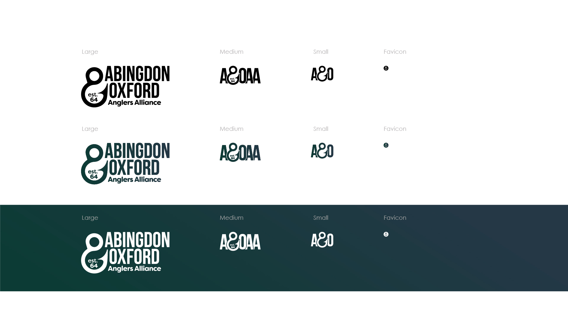
I wanted to develop a logo mark or icon that could be used independantly of the full logo and still communicate the key purpose. I designed the ampersand (and sign) to look like a hook and built the logo around this detail. I developed a responsive logo to meet the needs of a modern responsive website (read up on responsive logos here) , this collapsible approach meant that the Alliance had a solution for every need the logo might encounter.
You can see the logo in it’s variants below:


New website coming soon
The new logo is only part of the story though… The team at the Alliance also engaged me to deliver a brand new website for thier members and unlock the possibility of online permit purchasing.
During the COVID19 pandemic in 2020, the A&OAA had to adapt a digital sales route to make sure they could keep getting permits out to members. They did a great job utilising PayPal, Email and Facebook, but with no ecommerce structure to back them, it was a difficult process to manage. This lead them to push the button on launching a new website in 2020.
Read the full story here.


